The Solution
After an initial consultation and branding workshop, we began with a full evaluation of the Brookings brand to uncover audience insights and market perceptions. From this, we developed a new brand model anchored around Brookings’ Universal Truth: ‘People who understand the world of every client.’
This idea shaped the foundation of the new brand language – empathetic, intelligent, and locally grounded.
Using this insight, we built a refreshed tone of voice and visual system inspired by The Brookings Way: Personal Trust, Digital Agility, and People-Led Accountability. These three pillars became central to how Brookings presents itself across every platform.
While the core typography and colour palette were retained to preserve brand recognition, we introduced new design elements to enhance clarity, warmth, and modernity. This visual refresh was applied across:
- A proposed website redesign with a cleaner, more intuitive interface and stronger calls to action
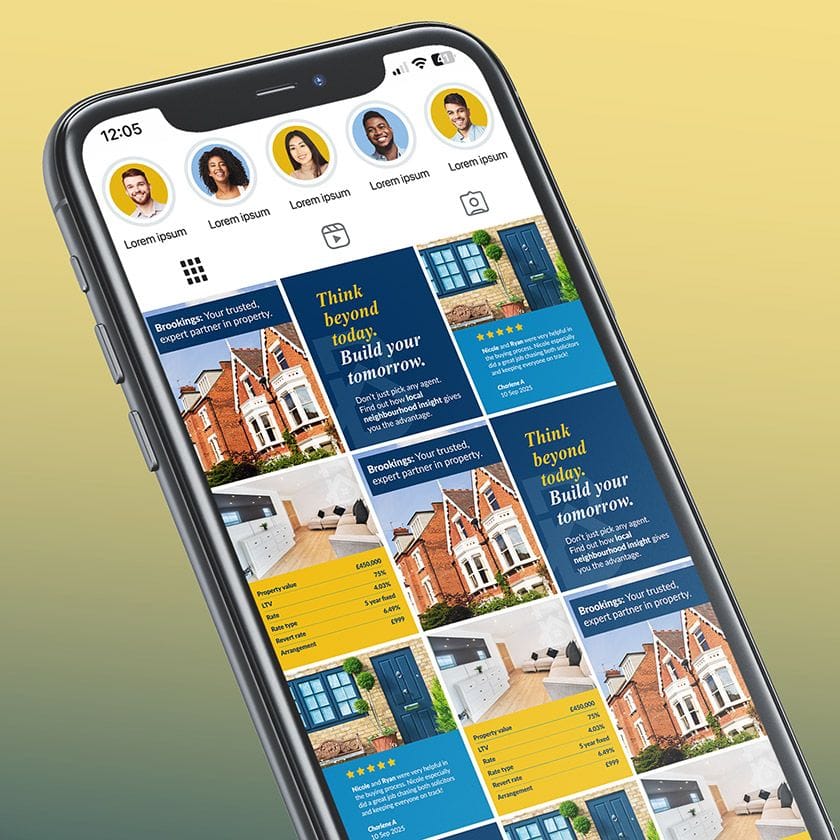
- A suite of social media templates built around confident imagery and simplified messaging
- Internal presentations and newsletters
- Proposed billboard concepts that bring to life the idea of ‘Local expertise, delivered like good neighbours.’
The new design system empowers the Brookings team to create content in-house with confidence and consistency, ensuring every communication reflects the brand’s balance of sharp professionalism and human connection.
Conclusion
The re-evaluation has re-energised the Brookings brand – aligning its identity, tone, and digital presence around a unified purpose. With a clearer voice and modernised design system, Brookings now stands out as ‘your trusted, expert partner in property’ – a brand that delivers the message of real people & real confidence through every interaction.
The result is a brand ready to grow with its clients: approachable, intelligent, and unmistakably Brookings.